 It took a long time to identify my dairy intolerance but once it was identified and managed my sense of taste and smell began to return and long term digestion problems resolved. My quality of life improved because of two simple things:
- I had a better understanding of my needs
- The information on food packaging labels allowed me to adapt my diet to those needs.
I can’t always avoid dairy products but when the labels make it clear it’s a choice between dairy or hunger I take pre-emptive action – a lactase tablet provides the enzyme I need to tackle the lactose I can’t digest; a pharmaceutical assistive technology….
The parallels between my dairy intolerance and the reading needs of a print impaired student are inescapable. There is a spectrum from food intolerance (which makes living uncomfortable) to food allergies (that can stop you living entirely). There is also a spectrum of print impairment. A dyslexic reader may read more laboriously if they can’t change the background colour of the page but a blind or motor impaired student may not be able to read at all if the interface requires them to use a mouse.
Digital accessibility is multi-layered but from the end user perspective it boils down to two very simple questions:
- What does the formatting of the file let me do?
- What does the interface through which I access the file let me do?
There is no persuasive argument why e-texts should not be highly accessible at source. Even if we accept that professional content producers might take a few years to notice accessibility standards and take heed of disability legislation we should not accept that accessibility information is kept from end users. Disabled students – and those who support them – need information on the characteristics of the files AND the features of the interface.
E-text formatting and e-text files
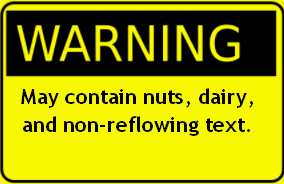
E-books and e-journals are – in theory – intrinsically more accessible and inclusive than print copies. Choices made in the production phase significantly add (or reduce) value to the accessibility of the e-book. Th elist below covers key production choices that make a positive difference. They significantly increase usability for disabled users. Whether or not these features are present should be transparently recorded in clear, plain English guidance. It’s the equivalent of the allergy warning on a food label.
- A properly tagged heading structure allows rapid navigation round the content,
- Tagging of reading order (so – for example – headers and footers don’t enter the text stream between page breaks or call out boxes don’t accidentally interleave text into unrelated sentences),
- A wide text magnification/zoom range (minimum 500%) with text reflowing to fit the page.
- Text summaries / alternatives for non-text content, for example the key points behind the purpose of an image or a table. This might be presented in an Alt Tag text, a caption or the body text.
The absence of these doesn’t mean the file is un-useable. But it does mean that the university or college supporting the student may have to recreate a more accessible version under The Copyright and Rights in Performances (Disability) Regulations 2014. Knowing this in advance, they can budget time and money to do so. Or they can tweak the reading list to include texts from more accessible suppliers.
Interface and reading tools
Life is very confusing for disabled readers and those who support them. They rarely know in advance the accessibility features they can expect in a given file from a given supplier. When the file is delivered they may find all the accessibility potential has been stripped out because of the interface through which it is delivered. Here are some observations from accessing a range of e-books from different suppliers:
How an accessible file renders in different types of reading tool
Browser (eg Edge, Chrome, FireFox or Opera)
PDFs rendered through a browser tend to lose most of their accessibility features such as navigation, colour/contrast options and text reflow. EPUB files delivered through the latest Edge browser have good accessibility. Plug-ins such as Readium for the Chrome and Firefox browsers also provide high levels of accessibility for EPUB files. HTML files work really well in a browser and there are many browser plugins that can enhance the reading experience.
Adobe Reader
PDF files viewed through Adobe Reader can have very high levels of accessibility, provided the native file has been created to reasonable accessibility standards (for example has been tagged for structural headings and reading order et cetera). Adobe Reader does not currently support EPUB files or HTML files.
Adobe Digital Editions
Ironically, Adobe’s flagship product for distributing commercial e-texts makes a poor job of rendering PDFs, providing no option for reflow, no colour/contrast options and limited magnification. It is equally poor at rendering EPUB files. It isn’t designed to render HTML files.
Bluefire Reader
PDF files viewed with Bluefire Reader have limited magnification, no reflow and minimal colour contrast options. However, Bluefire Reader provides many accessibility options for EPUB files, making it a considerably better reading solution than Adobe Digital Editions for EPUB. Blue fire Reader isn’t designed to render HTML files.
Bespoke interface (eg aggregator’s own ‘Read Online’ option
The current crop of bespoke ‘Read online’interfaces is generally poor. You can explore the relative performance of aggregators in the 2016 ebook audit reports. Most provide limited magnification, no reflow and no colour contrast options. This may change as some suppliers realise how low they scored!
The reader’s experience
My experience as a reader depends, therefore, on
- What the producer has done in relation to e-text file accessibility,
- What they tell me about what they have done,
- Which reading tools (or alternatives) they use to deliver the e-text files,
- What features they enable/disable in those reading tools,
- What they tell me about the accessibility features of the interface(s). This needs to include the features they’ve enabled or disabled – for example restricting clipboard access may restrict a text to speech user to hearing only 10% of the book. It’s helpful to be told that in advance.
Every single one of those points is known to the supplier – or they should be. Every one of them needs to be known to the end user too.
Realism and pragmatism
We all work in complex organisations with multiple demands on time and resources. This is not a counsel of perfection. Improving accessibility can take time and require buy-in from others; for example Adobe Digital Editions is one of the biggest barriers to an accessible reading experience for many print impaired students. It would be unreasonable to expect instant universal accessibility compliance, just as it would be unreasonable for me to expect all foods to be dairy free.
However, what is not unreasonable is to expect all players in the e-book supply chain to be
- transparent about the accessibility compliance of their products and
- honest about the accessibility pros and cons of the tools and interfaces through which their products are delivered.
Knowledge is power. It’s time disabled readers were empowered to know what products will meet their needs. It’s time those supporting them were empowered to anticipate potential workloads in adapting partially accessible e-books. It’s time that those publishers who have invested time and energy in accessibility can demonstrate who the culprits are when their investments are eroded along the supply line.
A little labelling can go a long way.